Mobile-First Web Design: Why 65% of Web Traffic Is Mobile

Mobile devices now generate 64.04% of all global website traffic as of Q4 2024, and the share keeps climbing (Statista, 2025). For small businesses in tourism, hospitality, and local services — where most of your traffic comes from someone Googling on a phone while standing on a sidewalk — the share runs 75–85%. If your site still looks like an afterthought on a 6.1-inch screen, you are losing real money every week.
Mobile-first web design is not a 2018 trend that "graduated." It is the baseline Google indexes from, the only context most of your prospects ever experience your brand in, and the single biggest determinant of whether they convert or leave. Yet most small business sites still load a desktop layout, shrink it, and call it "responsive."
Here is the actual data on mobile traffic in 2026, what Google rewards now that mobile-first indexing is complete, and the seven concrete things to fix on your site this month — pulled from audits I run weekly on Cabo and California small business websites. It's the mobile-experience chapter inside Why Your Small Business Website Loses Leads, which covers the 6 places small business sites quietly underperform.
Key Takeaways
- Mobile drives 64.04% of global website traffic in late 2024, up from 31% in 2015 (Statista, 2025)
- Google completed mobile-first indexing for 100% of websites by July 2024 — your desktop site is no longer the version Google ranks (Google Search Central, 2024)
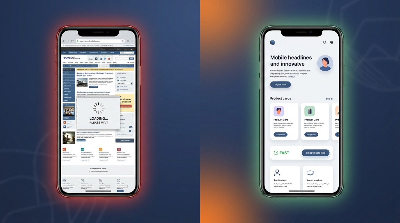
- 53% of mobile users abandon a site that takes longer than 3 seconds to load (Think with Google, updated 2024)
- Mobile pages have a 9.6% bounce rate increase per second of load time between 1s and 5s (Google/SOASTA Research, 2024)
- 76% of consumers who search local on a smartphone visit a business within 24 hours, and 28% make a purchase (Google Mobile Movement Study, 2024)
- 75% of pages must pass Core Web Vitals thresholds for a site to qualify for Google's "good" page experience signal (web.dev, 2025)
Why Mobile-First Web Design Is Non-Negotiable in 2026
The phrase "mobile-first" has been around long enough that some business owners assume it has been solved. It has not. The gap between sites that were built mobile-first and sites that were retrofitted is still the single most common cause of poor conversions I see in audits.
Three numbers drive the case:
1. Mobile owns the majority of web traffic, period. Statista's most recent data puts mobile at 64.04% of global website visits in Q4 2024, up from 31.16% in Q1 2015 (Statista, 2025). For tourism, hospitality, and local-service sites, the share is even higher. Google's own data on travel intent shows roughly 70% of travel-related searches happen on mobile, and that climbs above 80% during the actual trip — exactly when prospects are deciding where to eat dinner or which spa to book.
2. Google indexes from your mobile site. Google completed the mobile-first indexing rollout in July 2024 and stopped crawling desktop-only sites altogether (Google Search Central, 2024). What this means in practice: if your mobile site has fewer images, less content, broken structured data, or no schema markup, that is the version Google evaluates. Your beautiful desktop layout is invisible to the crawler.
3. Mobile users punish slow pages disproportionately. Think with Google's mobile speed research shows that the probability of a mobile bounce increases 32% as page load time goes from 1 to 3 seconds, 90% as it goes from 1 to 5 seconds, and 123% as it goes from 1 to 10 seconds. The average mobile site loads in 15 seconds. The math is brutal.
If you optimize one thing on your website this quarter, optimize the mobile experience. Everything else — copy, design, offers, ad spend — sits on top of that foundation. And before you commit to a full rebuild, decide whether you actually need a full multi-page site or a focused landing page — most owners pick the wrong shape and pay for it twice.
What "Mobile-First" Actually Means (And What It Doesn't)
There is real confusion between three terms business owners often use interchangeably. They are not the same.
Responsive design means the layout adapts to different screen sizes via CSS. A responsive site can still be slow, awkward to tap, and built desktop-first.
Mobile-friendly is Google's old, retired test for whether a page was usable on mobile. It was deprecated in December 2023 (Search Engine Land, 2023) because virtually every site passed it — the bar was too low.
Mobile-first is a design and engineering philosophy: you design and build the mobile experience first, then progressively enhance it for larger screens. Content, navigation, image sizes, font choices, and load order all start from the mobile context and scale up.
The three usually get blended together, but only the third one actually delivers the conversion lift you want. A site can be responsive and mobile-friendly and still be a dumpster fire on a phone.
How Google Mobile-First Indexing Changed the Game
Mobile-first indexing means Googlebot crawls your site as a mobile user, not a desktop one. The implications most small business owners miss:
- Hidden mobile content does not count. If you collapse content behind "Read more" on mobile but show it on desktop, Google sees the collapsed version.
- Image alt text and structured data must exist on the mobile version. A common WordPress plugin pattern is to render schema only in the desktop layout. Google sees nothing.
- Mobile robots.txt and meta tags are the source of truth. A noindex tag on the mobile template removes the entire URL from the index, even if the desktop tag says index.
- Page speed is measured against mobile devices on slow connections. Google's PageSpeed Insights mobile score is the one that matters for ranking.
If you have not personally walked through your top 10 pages on a mid-range Android phone over a 4G connection, you do not actually know how Google sees your site.
The Cost of a Non-Mobile-First Site, in Real Numbers
Slow, awkward mobile experiences are not a soft brand problem. They cost measurable revenue. Here is what the research shows:
- 53% of mobile visitors abandon any page that takes longer than 3 seconds to load (Think with Google, 2024).
- A 1-second improvement in load time can lift mobile conversions by 27% (Akamai Online Retail Performance Report, referenced 2024).
- Mobile sites that load in 5 seconds earn 2x the mobile ad revenue of sites that load in 19 seconds (Google/DoubleClick, 2024).
- 70% of mobile pages take nearly seven seconds for the visual content above the fold to display (Think with Google, 2024).
- Local search has become almost entirely mobile: 76% of people who search for something nearby on a smartphone visit a related business within 24 hours, and 28% make a purchase (Think with Google, 2024).
Translate that to a real Cabo restaurant: if 800 people a month search "best seafood Cabo San Lucas" on a phone and your site loads in 9 seconds, half of the people who clicked you bounced before the page even rendered. That is roughly 200–300 lost dinner reservations a month. The math is the same for a California spa, a Los Angeles HVAC company, or any service business that depends on local search.
The same pattern shows up across the small businesses I work with — and is one of the recurring themes in the common AI automation mistakes small businesses make breakdown. You can have the best AI agent in the world capturing leads, but if the site that loads first takes 12 seconds, you never get the chance to convert them.
Core Web Vitals: The Bar Google Actually Measures
Google's page experience signal is graded against Core Web Vitals thresholds, evaluated on real-world mobile devices. As of 2025 the three metrics and their "good" thresholds are:
- Largest Contentful Paint (LCP): under 2.5 seconds. Measures how fast the main content of the page renders.
- Interaction to Next Paint (INP): under 200 milliseconds. Replaced First Input Delay in March 2024 — measures the responsiveness of the entire interaction lifecycle.
- Cumulative Layout Shift (CLS): under 0.1. Measures how much the page jumps around as it loads.
A page passes the page experience signal only if 75% of real-user visits hit all three thresholds (web.dev, 2025). The data Google uses is the Chrome User Experience Report — actual browsing data from Chrome users, not a synthetic lab test. Only 48% of mobile sites currently clear all three, and LCP is the most commonly missed metric — the full breakdown of 2026 website load time benchmarks walks through where small business sites actually stack up against the bar.
What this means for small business sites: lab tools like Lighthouse give you a directional score, but the score that affects rankings is field data over a 28-day window. Fixing your mobile experience in February will start moving rankings in March.
7 Mobile-First Design Mistakes Most Small Business Sites Still Make
Recurring patterns from audits, ranked by how often they cost the business real money:
| # | Mistake | Core Web Vital Impact | Time to Fix |
|---|---|---|---|
| 1 | Heavy hero images (2–5MB) | LCP +4–6s | 30 min |
| 2 | Tap targets under 48×48 px | Mobile usability fail | 1–2 hr |
| 3 | Full-screen pop-ups | Intrusive interstitial penalty | 1 hr |
| 4 | Menu / rates as PDF | Indexation lost | 2–4 hr |
| 5 | Auto-playing video | LCP +2–3s, battery drain | 30 min |
| 6 | Forms with 5+ fields | Submission rate −40% | 1 hr |
| 7 | Render-blocking JS | LCP +1–4s | 2–3 hr |
1. Hero images that are too heavy
A 4MB hero image on a 4G connection takes 4–6 seconds to fully render. That single file blows your LCP target by itself. Every hero image should be under 200KB, in WebP or AVIF format, with explicit width and height attributes to prevent layout shift.
2. Tap targets smaller than 48×48 pixels
Google's mobile usability guidelines require 48×48 pixel touch targets with 8 pixels of spacing between them. Most "responsive" desktop sites still serve 30-pixel buttons crammed against each other in the mobile nav. Users mis-tap, get frustrated, and leave.
3. Pop-ups that block the whole screen
Google penalizes intrusive interstitials that cover the main content on mobile. Cookie banners that take up 60% of the screen, email pop-ups that fire on page load, and "verify your age" overlays are conversion killers and ranking drags. Use bottom-anchored bars or in-line offers instead.
4. Menu PDFs and unparseable images of text
Restaurants and services that publish their menu, rate sheet, or service list as a PDF or as a flat JPG are invisible to mobile-first indexing. Google ranks HTML pages with structured content far better than it ranks linked documents. Every PDF menu is a reservation Google sent to a competitor.
5. Auto-playing video without a poster image
Auto-playing video on mobile drains battery, eats data, and tanks LCP. Use a poster image and let users tap to play. iOS will block autoplay anyway on a slow connection — you are designing around a video that never starts.
6. Forms with too many fields
Mobile keyboards turn every form field into friction. The data is consistent across studies: every field beyond three reduces submission rate by roughly 10%. A booking form should be name, phone, and one detail. Everything else can come in the follow-up email or — better — through an AI chatbot that handles the conversation directly. For a broader walkthrough of the bolt-on tools that replace static forms, see AI lead capture for websites — chatbots, smart forms, and instant-response stacks all install without rebuilding the site.
7. Inline JavaScript that blocks rendering
This one is technical but high-impact. Third-party scripts loaded synchronously in the <head> — review widgets, chat plugins, analytics tags, ad pixels — block the browser from rendering anything until they finish. The fix is async and defer attributes on third-party scripts and lazy-loading anything below the fold.
How to Audit Your Site for Mobile-First in 30 Minutes
A practical workflow that does not require a developer:
Step 1 — Run PageSpeed Insights on your top 5 pages Go to pagespeed.web.dev and test your homepage, top service page, contact page, and your two highest-traffic blog posts. Note the mobile score, not desktop. Aim for 80+ on mobile; 70 is workable, under 60 is bleeding.
Step 2 — Check Core Web Vitals in Search Console In Google Search Console, the "Core Web Vitals" report shows real-user data. URLs flagged "Poor" or "Needs Improvement" are the ones costing you rankings. Start with the worst offenders.
Step 3 — Walk through your site on a mid-range Android over 4G Throttle your phone connection or actually use a 4G hotspot. Browse your site as a customer would: home → service page → contact form → submit. Time each step. Note every spot you got frustrated. That is your prioritized fix list.
Step 4 — Test your forms with one thumb Most users hold the phone in one hand. If you can fill out and submit your booking form one-handed without zooming, you pass. If not, your tap targets, field sizes, or layout need work.
Step 5 — Check your structured data on mobile Use Google's Rich Results Test on your mobile URL. Confirm LocalBusiness, Restaurant, Hotel, or whatever schema you rely on actually renders in the mobile version of the page.
This audit takes about 30 minutes and surfaces the 80% of issues a typical small business site has. The remaining 20% — code-level performance work, server response time, image pipeline upgrades — is where you bring in a developer.
Mobile-First and Local SEO: The Cabo Multiplier
Local search is now overwhelmingly mobile, and the gap shows up most clearly in markets like Los Cabos. Tourists land at SJD with their phone in hand and a 30-second window to decide where to eat dinner. The Google Business Profile that shows up first, loads fast, and answers their question wins.
The intersection of mobile-first design and local SEO is where most Cabo and California businesses leak the most revenue. A perfect Google Business Profile pointing to a website that takes 12 seconds to load on mobile undoes most of the work. Fixing the mobile experience compounds with everything else you do — citations, reviews, local content. I cover the full picture in the Local SEO Los Cabos guide.
Frequently Asked Questions
Is mobile-first web design still relevant in 2026? More than ever. Mobile drives 64% of global web traffic and Google fully indexes the mobile version of every site. A non-mobile-first site is invisible to roughly two thirds of search traffic and ignored by Google's primary crawler.
How do I know if my site is mobile-first or just responsive? Run PageSpeed Insights on the mobile tab. A mobile score under 70 almost always means the site was built desktop-first and adapted. A native mobile-first site usually scores 85+ out of the box because the design constraints force the right decisions early.
What's the difference between mobile-friendly and mobile-first? Mobile-friendly means usable on a phone — basic readability, no horizontal scroll. Mobile-first means designed and engineered for the phone first, with desktop as an enhancement. Almost every modern site is mobile-friendly. Far fewer are actually mobile-first.
How much does it cost to convert a small business site to mobile-first? For a 5–10 page small business site, expect $1,500–$4,000 if the existing site has a clean structure and just needs a rebuild on a modern stack. If the site is a 10-year-old WordPress install with 40 plugins, expect closer to $5,000–$8,000 because the cleanup work outweighs the build.
Will fixing mobile speed actually move my rankings? Yes, but not overnight. Core Web Vitals are calculated on a 28-day rolling window of real Chrome user data. You will start seeing field data improvements in 4–6 weeks and ranking movement in 6–10 weeks. This is one of the few SEO levers with real, predictable cause and effect.
Do I need a separate mobile site (m.example.com) anymore? No. Separate mobile URLs were a 2014 pattern that Google now actively discourages. Use a single responsive, mobile-first site with proper viewport meta tags. Everything else creates duplicate content and split signals.
What's the single highest-ROI mobile fix for a small business website? Compress and convert your hero image. Most small business hero images are 2–5MB JPGs that take 4–6 seconds to load on mobile. Replacing them with 150–250KB WebP files typically pulls 3–5 seconds off your LCP — which is usually the difference between bouncing and converting.
The Bottom Line
Mobile-first web design is not a design preference — it is the operating environment your business actually competes in. Sixty-four percent of your visitors are already on a phone. Google indexes from the mobile version of your site. And the difference between a 3-second and a 9-second mobile load is the difference between a customer and a bounce.
The good news: most small business sites — including the ones outranking you — are not mobile-first either. Fixing your mobile experience is one of the rare SEO and conversion levers where the work is well-defined, the impact is measurable, and the competitive bar is low.
If you want a free 30-minute audit of your site's mobile performance, ranking gaps, and the specific fixes that would move the needle for your business, book a discovery call and I'll walk you through it page by page.